


Intro
I recently had the need to monitor multiple web pages and filter information from them. This is a rather simple task but it's time consuming and error prone. Every time I do it, it takes time to find the right data, analyze it and save it. In addition, often I would like to monitor multiple web sources simultaneously without distraction in a homogeneous style.
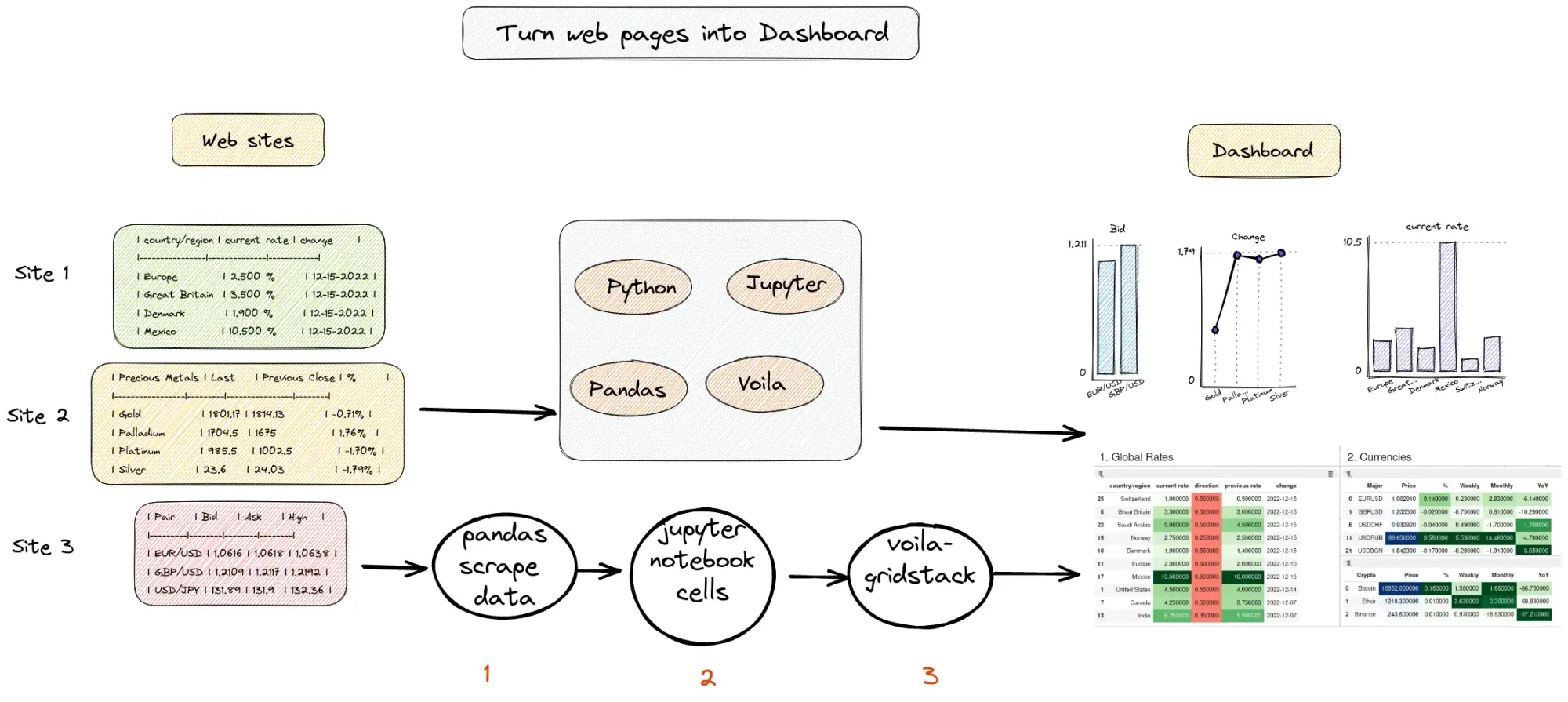
I did research for this problem but nothing was close enough to my needs. What I need is to build a beautiful dashboard from multiple web sites. In the past, I was using CRON jobs, Python scripts and Jupyter notebooks to collect data in one place.
Finally I found a better solution which extracts data from web pages and turns them into a dashboard. You will also learn how to turn any Jupyter Notebook into a dashboard in seconds.
Setup
Prerequisite
Voilà
Voilà is a Python package which turns Jupyter notebooks into standalone web applications. It can be used as a standalone app with the new Jupyter kernel or inside Jupyter.
It can be installed by:
pip install voila
Voilà provides a JupyterLab extension that displays a Voilà preview of your Notebook in a side-pane. To install the extension from source, run the following command.
jupyter labextension install @voila-dashboards/jupyterlab-preview
voila-gridstack
voila-gridstack is gridstack-based template for Voilà.
pip install voila-gridstack
1. Scraping with Pandas
Our goal is to make quick and easy extracting data from multiple sources into a single dashboard. There are many ways to scrape data with Python. The simplest and easiest way to scrape tabular data is by using Pandas. We will cover two different options:
- basic extraction
- adding user agent
Pandas scrape tables
Pandas offers handy method pandas.read_html which reads HTML tables into a list of DataFrames. By default extracts all tables from a given URL:
import pandas as pd

url_cur = 'https://en.wikipedia.org/wiki/List_of_countries_by_forest_area'
df_ls = pd.read_html(url_cur)
df_ls[0]
| Region | 1990 | 2000 | 2010 | 2020 | |
|---|---|---|---|---|---|
| 0 | World | 4236433 | 4158050 | 4106317 | 4058931 |
| 1 | Europe (including Russia) | 994319 | 1002268 | 1013982 | 1017461 |
| 2 | South America | 973666 | 922645 | 870154 | 844186 |
| 3 | North America and Central America | 755279 | 752349 | 754190 | 752710 |
| 4 | Africa | 742801 | 710049 | 676015 | 636639 |
| 5 | Asia | 585393 | 587410 | 610960 | 622687 |
| 6 | Oceania | 184974 | 183328 | 181015 | 185248 |
Pandas read_html + user agent
Some websites with cause Pandas method read_html() to return:
HTTPError: HTTP Error 403: Forbidden
In order to solve this problem we will add user agent and use package requests:
import pandas as pd
import requests

url_cur = 'https://en.wikipedia.org/wiki/List_of_countries_by_forest_area'

header = {
  "User-Agent": "Mozilla/5.0 (X11; Linux x86_64) AppleWebKit/537.36 (KHTML, like Gecko) Chrome/50.0.2661.75 Safari/537.36",
  "X-Requested-With": "XMLHttpRequest"
}

r = requests.get(url_cur, headers=header)

ls_cur = pd.read_html(r.text)
Adding a user agent as headers solves the HTTPError: HTTP Error 403: Forbidden returned from Pandas.
2. Styling and plotting
Python and Pandas offer multiple ways for styling and creating beautiful visualizations. For simplicity we will mention only two in this article.
DataFrame as heatmap
The first approach is to use method `.style.background_gradient() that can be used create nice looking heatmaps:
df.style.background_gradient(cmap='Greens', subset=str_cols)\
	.background_gradient(cmap='Blues', subset='Price')
To find more about it check out: How to Display Pandas DataFrame As a Heatmap
Quick visualization with seaborn
The second way for creating quick and nice visualizations is by using libraries like seaborn. The advantage of seaborn is simplicity of usage and diversity of plots. To learn more about different visualization options and styles refer to: Pandas Visualization Cheat Sheet
3. Turn Jupyter Notebook into Dashboard
Once we have data collected and all visualizations are ready for use - we can start building our dashboard.
Open voila-gridstack editor
To open voila-gridstack editor we have two options in JupyterLab. The first way is by:
- right clicking the notebook
- Open with
- Voilà Gridstack
Alternatively we can use a button on the right top of an opened notebook.
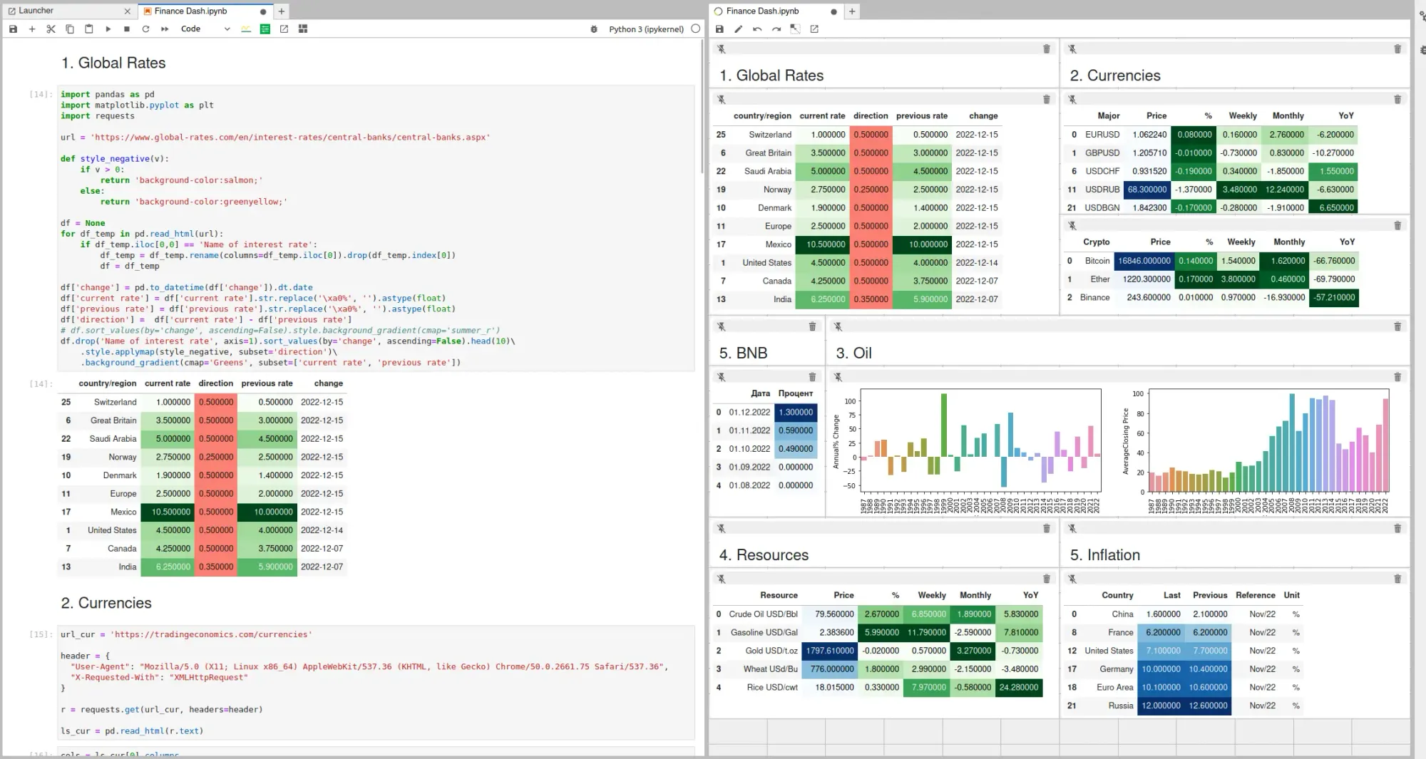
drag-and-drop cells
We can see the notebook and the editor side by side. We can select a cell and move it to the voila-gridstack editor. Then we can resize or move the cell in the voila-gridstack editor. The image below shows the process.
Open new voila window
Once we are happy with the outlook of the dashboard we can save it. Finally we can open it as a separate window or use it as a standalone application.
Conclusion
There are many options for building a dashboard within the Python ecosystem. Voila offers a quick and easy way to render Jupyter notebooks as a dashboard . In my experience, Voila is the best choice for beginners and people with medium experience.
I hope this article will be a useful guide for people interested in building their own dashboards for their practical problems. Feel free to leave a comment to ask a question.