


1. Overview
In this tutorial, we'll learn how to display Pandas DataFrame as a heatmap.
So we might start with: what is a heatmap in Data Science? According to wikipedia:
A heat map (or heatmap) is a data visualization technique that shows the magnitude of a phenomenon as color in two dimensions.
2. Setup
We are going to create test DataFrame following two articles:
- How to Create a Pandas DataFrame of Random Integers
- How to Easily Create Dummy DataFrame with Test Data?
We are using np.random.randn(10, 3) to create DataFrame with 10 rows and 3 columns- with random values:
import numpy as np
import pandas as pd
from pandas.util.testing import makePeriodSeries

s = makeTimeSeries(10)

cols = ['col_1', 'col_2']
df = pd.DataFrame(abs(np.random.randn(10, 2)), columns=cols)
df['item'] = 'item: ' + df.index.astype(str)
df['date'] = s.index
| col_1 | col_2 | item | date | |
|---|---|---|---|---|
| 0 | 0.448082 | 0.334594 | item: 0 | 2000-01-03 |
| 1 | 0.727165 | 0.349513 | item: 1 | 2000-01-04 |
| 2 | 0.628442 | 0.485067 | item: 2 | 2000-01-05 |
| 3 | 0.193080 | 1.361732 | item: 3 | 2000-01-06 |
| 4 | 0.358394 | 0.746719 | item: 4 | 2000-01-07 |
| 5 | 0.089303 | 1.600171 | item: 5 | 2000-01-10 |
| 6 | 0.126041 | 0.943686 | item: 6 | 2000-01-11 |
| 7 | 0.002382 | 0.516401 | item: 7 | 2000-01-12 |
| 8 | 0.058525 | 1.233783 | item: 8 | 2000-01-13 |
| 9 | 1.433061 | 1.703305 | item: 9 | 2000-01-14 |
3. Pandas: Display DataFrame as heatmap with style.background_gradient
Pandas offer method style.background_gradient() which helps us very easily to create beautiful colored heatmap:
df.style.background_gradient(cmap='Greens')
The background gradient it will applied only for the numeric columns:
| col_1 | col_2 | item | date | |
|---|---|---|---|---|
| 0 | 0.448082 | 0.334594 | item: 0 | 2000-01-03 |
| 1 | 0.727165 | 0.349513 | item: 1 | 2000-01-04 |
| 2 | 0.628442 | 0.485067 | item: 2 | 2000-01-05 |
| 3 | 0.193080 | 1.361732 | item: 3 | 2000-01-06 |
| 4 | 0.358394 | 0.746719 | item: 4 | 2000-01-07 |
| 5 | 0.089303 | 1.600171 | item: 5 | 2000-01-10 |
| 6 | 0.126041 | 0.943686 | item: 6 | 2000-01-11 |
| 7 | 0.002382 | 0.516401 | item: 7 | 2000-01-12 |
| 8 | 0.058525 | 1.233783 | item: 8 | 2000-01-13 |
| 9 | 1.433061 | 1.703305 | item: 9 | 2000-01-14 |
The method background_gradient() take as argument cmap which can have different values like:
BluesGreens
To learn more about Pandas colors and palettes please visit:
4. Seaborn: Display DataFrame as heatmap with sns.heatmap
There is a library for data visualization called Seaborn: statistical data visualization.
This library offers method called: seaborn.heatmap()
The method works only on numerical values. So we can use it as follow:
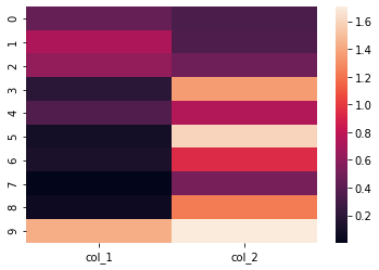
import seaborn as sns

sns.heatmap(df[['col_1', 'col_2']])
the DataFrame will looks like:
If you try to call the method: sns.heatmap() on the whole DataFrame you will get an error:
ValueError: could not convert string to float: 'item: 0'
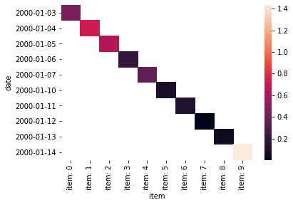
Another way to solve the error is by pivoting data on some columns. For example we can pivot on columns:
- "date"
- "item"
and get as values column - "col_1":
sns.heatmap(df.pivot("date", "item",values='col_1'))
This will convert the DataFrame into beautiful heatmap:
Again we can provide parameter cmap which can take similar values as the background_gradient().
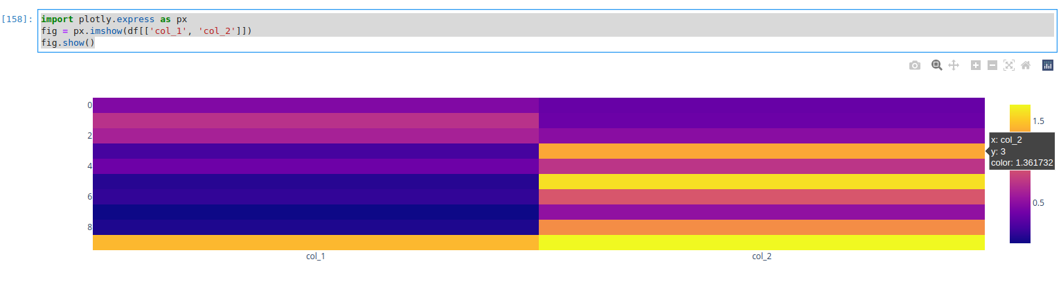
5. Interactive heatmap with Plotly
If you like to make your DataFrame as aa interactive heatmap then you can use library called:
Again as Seaborn we need to use only numeric values:
import plotly.express as px
fig = px.imshow(df[['col_1', 'col_2']])
fig.show()
Otherwise errors will be raised. The resulted heatmap will looks like:
For categorical data we can use pivot() or similar operation in order to make it good for plotting as a heatmap.
The error is a bit different:
TypeError: Object of type Period is not JSON serializable
6. Conclusion
We covered the most popular ways to convert DataFrame to:
- heatmap for numeric and non numeric data
- heatmap with seaborn
- data transformation for categorical data with pivot
- interactive heatmap
This article will help you to select the best way to present your numeric data.