


This visualization cheat sheet is a great resource to explore data visualizations with Python, Pandas and Matplotlib. The Python ecosystem provides many packages for producing high-quality plots, graphs and visualizations.
In this guide, we will discuss the basics and a few popular visualization choices. The article starts with the basic steps for creating visualization. Next these steps are covered in detail. The end of this article has useful resources for visualizations - free books, guides, galleries.
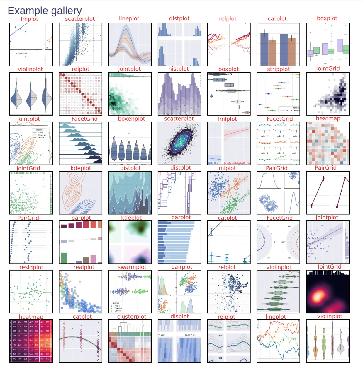
There are summary images showing multiple visualizations at once. The goal of this guide is to help you building and customizing data visualizations.
Let's dive into visualization cheat sheet. Below you can find most popular plots from Seaborn:
How to create good visualization
Python offers a ton of options and ways to visualize and summarize data which makes Python a natural choice for Data science.
Every great story starts with an idea. The same is with the visualization - we need idea and steps to follow to create great visualization.
- Idea
- Collect and select data
- Data cleaning
- Prepare data
- dimensions
- X and Y axis data
- plot type - boxplot, line chart
- Select tool
- Select style and color palette
- Customize the plot
- title
- labels
- data format
- size
Let your data and plots tell your story.
Data Setup
In this post we will use two DataFrames:
- DataFrame with random numbers
- Seaborn dataset
Creating DataFrame with 1000 numbers using normal distribution:
import pandas as pd
import numpy as np

ts = pd.Series(np.random.randn(1000), index=pd.date_range("1/1/2000", periods=1000))
df = pd.DataFrame(np.random.randn(1000, 4), index=ts.index, columns=list("ABCD"))
df = df.head(5)
result:
| A | B | C | D | |
|---|---|---|---|---|
| 2000-01-01 | -0.004858 | 0.618783 | -0.960541 | -0.118617 |
| 2000-01-02 | -0.476119 | 0.972206 | 0.457535 | -0.099867 |
| 2000-01-03 | -0.043310 | 0.218806 | -0.751540 | -0.501480 |
| 2000-01-04 | -1.913368 | 0.143043 | 1.140921 | -0.569990 |
| 2000-01-05 | 1.076793 | 0.809909 | 1.009482 | 0.716194 |
Seaborn DataFrame
import seaborn as sns

glue = sns.load_dataset("glue").pivot("Model", "Task", "Score")
df_tit = sns.load_dataset("titanic")
penguins = sns.load_dataset("penguins")
df_sns = sns.load_dataset('flights')
data looks like is:
| year | month | passengers | |
|---|---|---|---|
| 0 | 1949 | Jan | 112 |
| 1 | 1949 | Feb | 118 |
| 2 | 1949 | Mar | 132 |
| 3 | 1949 | Apr | 129 |
| 4 | 1949 | May | 121 |
Pandas visualization cheat sheet
Pandas can visualize DataFrame by using the method plot(). It has a backend specified by the option plotting.backend - by default - matplotlib.
Documentation for this method is available on this link: DataFrame.plot.
Setup, import, save
We need several imports to plot data with Python, Pandas and Matplotlib.
import pandas as pd
import matplotlib.pyplot as plt
Save and show figure:
plt.savefig('plot.png')
plt.savefig('plot.png',  transparent=True) #transparent

plt.show()
Figure
To create new figure in Matplotlib with a given size:
- set size in inches
- figaspect will determine the width and height for a figure that would fit array preserving aspect ratio
fig = plt.figure()

fig = plt.figure(figsize=(10,5)) # size in inches

fig = plt.figure(figsize=plt.figaspect(3.0))

w, h = figaspect(2.)
fig = Figure(figsize=(w,h))
Axes
To add and delete axes
fig.add_axes()
fig.add_axes(ax)
fig.delaxes(ax)
Subplot
Working with Subplots in Matplotlib
add_subplot(nrows, ncols, index, **kwargs)
add_subplot(pos, **kwargs)
add_subplot(ax)
add_subplot()

ax1 = fig.add_subplot(111) #row/col/ix
ax2 = fig.add_subplot(112)

fig, axes = plt.subplots(nrows=2,ncols=2)
fig, axes = plt.subplots(nrows=4)
Matplotlib Markers
ax.scatter(x,y,marker= ".")
ax.plot(x,y,marker= "o")
Available markers in Matplotlib:
"."- point"o"- circle"v"- triangle down"s"- square"D"- diamond"*"- star marker
To find more markers we can visit: matplotlib.markers API
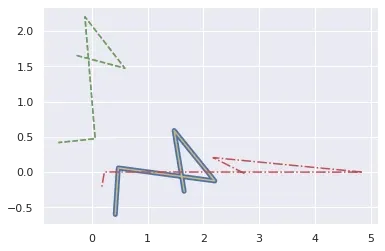
Linestyles in Matplotlib
To find different line styles we can visit: set_linestyle:
'-'- solid line'--'- dashed line'-.'- dash-dotted line':'- dotted line
x = df['A']
y = df['B']

plt.plot(x,y,linewidth=5.0)
plt.plot(x,y,linestyle= 'solid' , color='y')
plt.plot(y,x,ls= '--')
plt.plot(y,x,'--' ,x**2,y**3,'-.' )
Plot different line styles with Matplotlib:
- color
- style
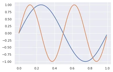
from math import *
import numpy as np

x = np.arange(0,1.0,0.01)
y1 = np.sin(2*pi*x)
y2 = np.sin(4*pi*x)
lines = plt.plot(x, y1, x, y2)

plt.setp(lines, linewidth=2)
Plot different color lines with plt.setp:
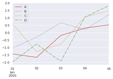
import matplotlib.pyplot as plt
import numpy as np
import pandas as pd


cycler = plt.cycler(linestyle=['-', ':', '--', '-.'],
                    color=['r', 'b', 'y', 'g'])
fig, ax = plt.subplots()
ax.set_prop_cycle(cycler)
df.plot(ax=ax)
plt.show()
multiple line styles and colors:
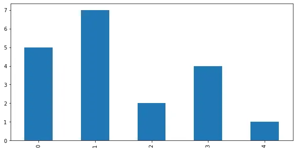
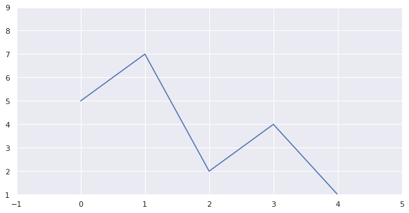
Pandas plot Series
To plot Pandas Series we can call method plot() directly on the Series:
import pandas as pd
s = pd.Series([5, 7, 2, 4, 1])
ax = s.plot(kind='bar', figsize=(10,5))
The result is bar plot from the Series:
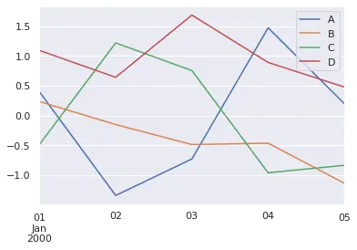
Pandas plot DataFrame
We can Plot DataFrame in Pandas by calling the method plot().
ax = df.plot()
By default all numeric columns will be used for the visualization:
Prior plotting DataFrame we can:
- select only the columns that will be plot
- set index or select X and Y data
- format and clean data
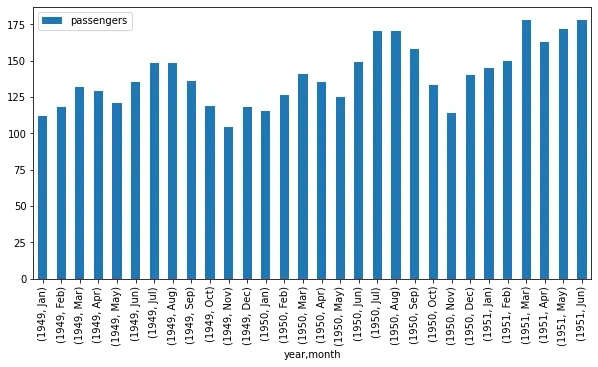
To plot DataFrame as bar plot, using the year and month as X axis with custom figure size we can do:
df.set_index(['year', 'month']).plot(kind='bar', figsize=(30,10))
This will plot number of passengers as Y axis:
Title, Labels, Legend
ax.set_xlabel('Year')
ax.set_ylabel('Passenger')
ax.set_title('Passengers per year')
ax.legend(labels, loc='best')

ax.set(title= 'Title', ylabel= 'Y label',  xlabel= 'X axis')
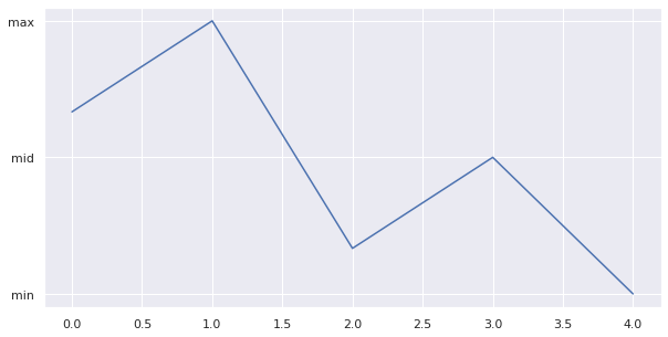
Ticks
import pandas as pd
s = pd.Series([5, 7, 2, 4, 1])
ax = s.plot(figsize=(10,5))

ax.yaxis.set(ticks=range(1,9,3), ticklabels=['min', 'mid', 'max'])
ax.tick_params(axis= 'y', direction= 'out', length=5)
result:
Margins, Limits
import pandas as pd
s = pd.Series([5, 7, 2, 4, 1])
ax = s.plot(figsize=(10,5))

ax.margins(x=0.5,y=0.5)
# ax.axis('equal') # Equal axis size
# ax.set_xlim(1,5) # set x limit
ax.set(xlim=[-1,5],ylim=[1,9]) # set x & y limits
result:
Parameters
x- X axis datay- Y axis datakind='bar'- plot typeax-figsize- plot size in inchessubplots=True- subplots for each columnsharex=False- in case of subplots - should X axis be sharedlayout=(3,2)- shape of the subplots - number of rows and columns
title- title of the plotxticks/yticks- values to use for the xticks/yticksxlabel/ylabel- name to use for the labels on x-axis/y-axisfontsize=12- font size for titlecolor='green'- plot colorcolor = ['lightblue', 'r', 'y']
more parameters on: plot()
Example for parameter subplots=True:
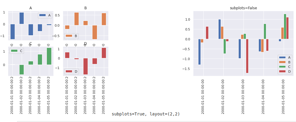
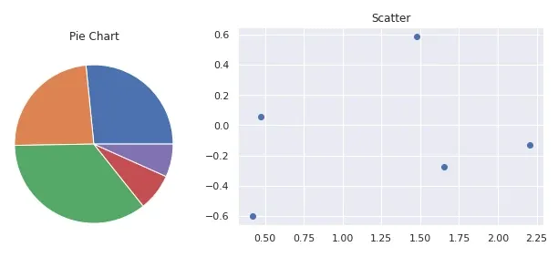
Display two plots - side by side
from matplotlib import pyplot as plt

# First plot
ax = plt.subplot()
plt.pie( data=df, x='A')
plt.title( 'bar' )
plt.show()

# Second plot
ax = plt.subplot()
plt.scatter( data=df, x='A', y='B' )
plt.title( 'scatter' )
plt.show()
Two plots side by side - pie chart and scatter plot:
Matplotlib subplots
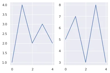
import matplotlib.pyplot as plt
import numpy as np

data = np.array([1, 4, 2, 3, 2])
plt.subplot(121)
plt.plot(data)

data = np.array([5, 7, 3, 8, 3])
plt.subplot(122)
plt.plot(data)
plt.show()
result:
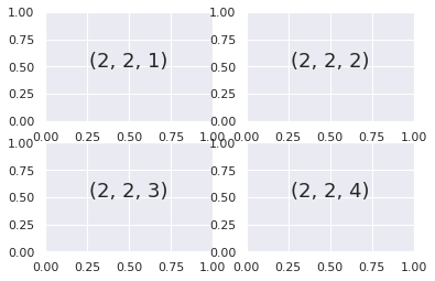
Grids of Subplots
for i in range(1, 5):
    plt.subplot(2, 2, i)
    plt.text(0.5, 0.5, str((2, 2, i)),
             font size=18, ha='center')
result:
Types of Pandas plots
List of the available chart types for plot() method. The plot type can be set as parameter - kind:
line: line plot (default)bar: vertical bar plotbarh: horizontal bar plothist: histogrambox: boxplotkde: Kernel Density Estimation plotdensity: same as 'kde'area: area plotpie: pie plotscatter: scatter plot (DataFrame only)hexbin: hexbin plot (DataFrame only)
Every available plot in Pandas is shown below:
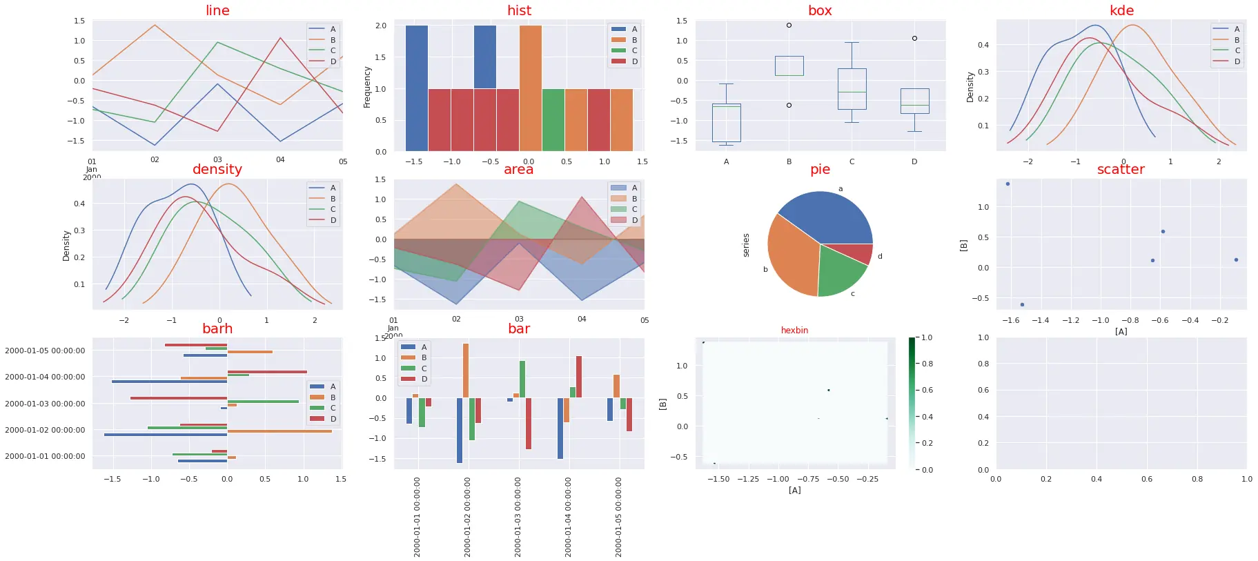
The code below generates all plots:
import pandas as pd
import numpy as np
import matplotlib.pyplot as plt
import seaborn as sns; sns.set_theme()

ts = pd.Series(np.random.randn(1000), index=pd.date_range("1/1/2000", periods=1000))
df = pd.DataFrame(np.random.randn(1000, 4), index=ts.index, columns=list("ABCD"))
df = df.head(5)

plots = [ 'line', 'hist', 'box', 'kde', 'density', 'area', 'pie', 'scatter', 'barh', 'bar', 'hexbin']

cols = df.columns
row_num = 3
col_num = 4
row_n = -1
col_n = 0

fig, axes = plt.subplots(row_num, col_num, squeeze=False, figsize=(20,14))

for ix, plot in enumerate(plots):
    axes[row_n, col_n].title.set_size(20)
    axes[row_n, col_n].title.set_color('red')
    col_n = ix % col_num
    if col_n == 0:
        row_n = row_n + 1
    if plot not in ['area', 'pie', 'scatter', 'hexbin']:
        df.plot(kind=plot,  ax=axes[row_n, col_n], title=plot, figsize=(30,12))
    elif plot == 'area':
        df.plot(kind=plot,  ax=axes[row_n, col_n], title=plot, stacked=False)
    elif plot == 'pie':
        series = pd.Series(3 * np.random.rand(4), index=["a", "b", "c", "d"], name="series")
        series.plot.pie(ax=axes[row_n, col_n], title=plot);
    elif plot == 'scatter':
        df.plot(kind=plot,  ax=axes[row_n, col_n], title=plot, x=['A'], y=['B'])
    elif plot == 'hexbin':
        df.plot(kind=plot,  ax=axes[row_n, col_n], title=plot, x=['A'], y=['B'])

plt.show()
Seaborn vs Matplotlib
Seaborn is based on Matplotlib. It enhances Matplotlib by simplifying the plot process and adding new features.
On the image below we can see all Seaborn plots like:
Seaborn setup
We can import and load datasets with seaborn by next code:
import seaborn as sns

glue = sns.load_dataset("glue").pivot("Model", "Task", "Score")
df_sns = sns.load_dataset('flights')
df_tit = sns.load_dataset("titanic")
penguins = sns.load_dataset("penguins")
Seaborn heatmap
To plot heatmap with seaborn we can do simply:
sns.heatmap(glue)

Seaborn boxplot
Plotting boxplot in Seaborn is as easy as:
df_tit = sns.load_dataset("titanic")
sns.boxplot(x=df["age"])
Seaborn barplot
For barplot we need to:
- select data source
- X and Y axis - data
penguins = sns.load_dataset("penguins")
sns.barplot(data=penguins, x="island", y="body_mass_g")
Seaborn histogram
Seaborn histogram is called - histplot:
penguins = sns.load_dataset("penguins")
sns.histplot(data=penguins, x="flipper_length_mm")
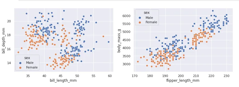
Seaborn multiple plots
To plot multiple visualization in Seaborn side by side we can do:
import pandas as pd
import seaborn as sns
import matplotlib.pyplot as plt

df = sns.load_dataset('penguins')

sns.scatterplot(data=df, x='bill_length_mm', y='bill_depth_mm', hue='sex')
plt.show()

sns.scatterplot(data=df, x='flipper_length_mm', y='body_mass_g', hue='sex')
plt.show()
result:
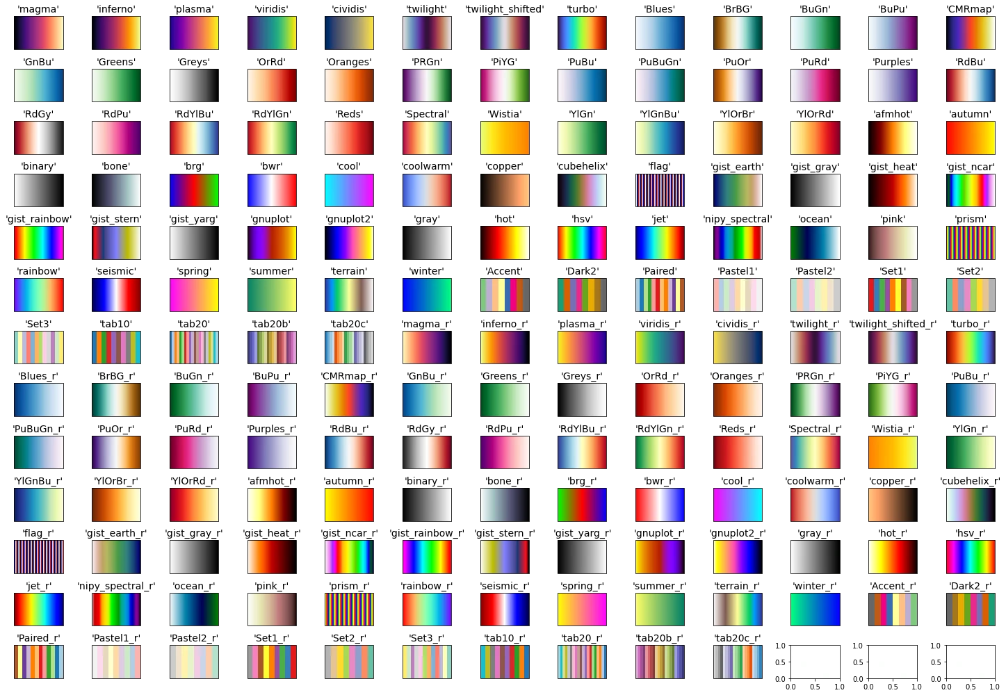
Colors
Python comes with a huge variety of named colors and palettes like the one shown below. To find the full list of colors check:
- Full List of Named Colors in Pandas and Python
- How to Get a List of N Different Colors and Names in Python/Pandas
Changing colors in matplotlib:
color = 'red'
mpl.rcParams['text.color'] = color
mpl.rcParams['axes.labelcolor'] = color
mpl.rcParams['xtick.color'] = 'y'
mpl.rcParams['ytick.color'] = 'b'
Data Visualization Libraries
- Matplotlib - most popular and widely-used plotting library
- seaborn - based on Matplotlib. High-level interface for drawing attractive and informative statistical graphics
- plotly - Plotly's Python graphing library makes interactive, publication-quality graphs.
- bokeh - interactive visualization library
- Vega-Altair - produces beautiful and effective visualizations with a minimal amount of code.
- pygal is a dynamic SVG charting library written in python
- geoplotlib - open-source Python library for visualizing geographical data.
Materials/Books for data visualization
Free Materials
Paid Books
- Storytelling with Data: A Data Visualization Guide for Business Professionals - Don't simply show your data—tell a story with it!
- Storytelling with Data: Let's Practice! - Influence action through data!
- Information is Beautiful - A stunning visual journey through the most amazing, beautiful, and positive things happening in the modern world.
- Better Data Visualizations A Guide for Scholars, Researchers, and Wonks - essential strategies to create more effective data visualizations
Collections
- R Data Visualization Books - 17 books for Data Visualization and R
Resources Data Visualization
- https://www.python-graph-gallery.com/ - collection of hundreds of charts made with Python
- https://www.data-to-viz.com/ - leads you to the most appropriate graph for your data
- https://www.reddit.com/r/dataisbeautiful/ - DataIsBeautiful is a reddit for visualizations that effectively convey information
- https://www.reddit.com/r/dataisugly/ - bad data visualizations